Fourth Ward District
A district identity for Atlanta’s Old Fourth Ward.
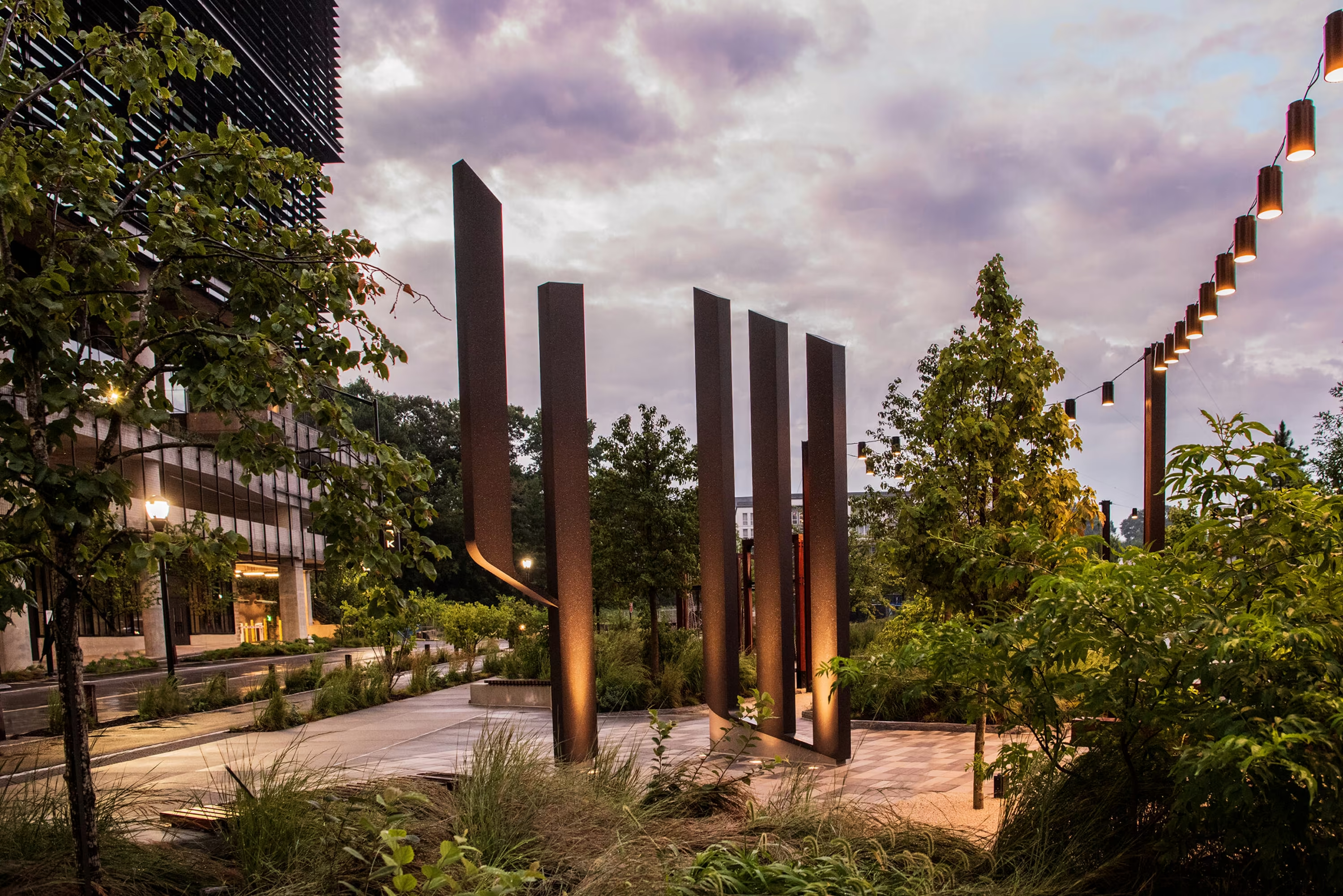
In a neighborhood carrying more history than most cities, the Fourth Ward identity has to hold its own: monumental where the district is monumental, quiet where daily life takes over.
The Identity
The 4W monogram compresses the district’s name into one mark: a numeral and a letter drawn as a single set of strokes, cut with the same edge. From the start it was drawn to stand. On the plaza the mark is freestanding steel, sculpture from most approaches, and from one vantage the columns align and the monogram appears. Across the district it repeats at every scale, from monument to printed matter.
The Letters
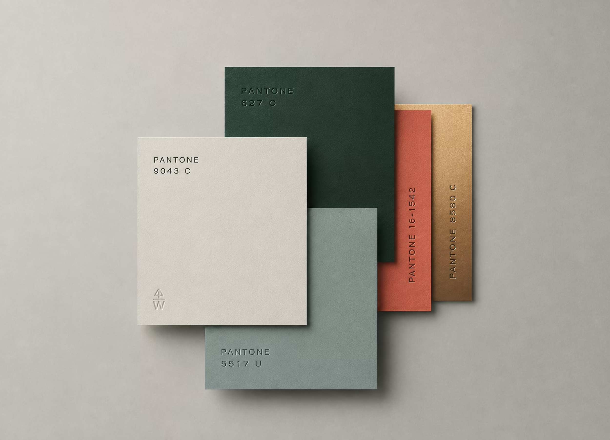
Two families carry the district’s voice: Titling Gothic, wide and civic, cut for signage and headlines; Mercury, a serif for the longer read. Both were chosen for how they wear in place, on masonry, on paper, on screen.
The District From Above
Cinq also photographs Fourth Ward from the air: aerials and film made for leasing, press, and the running record of a place taking shape.
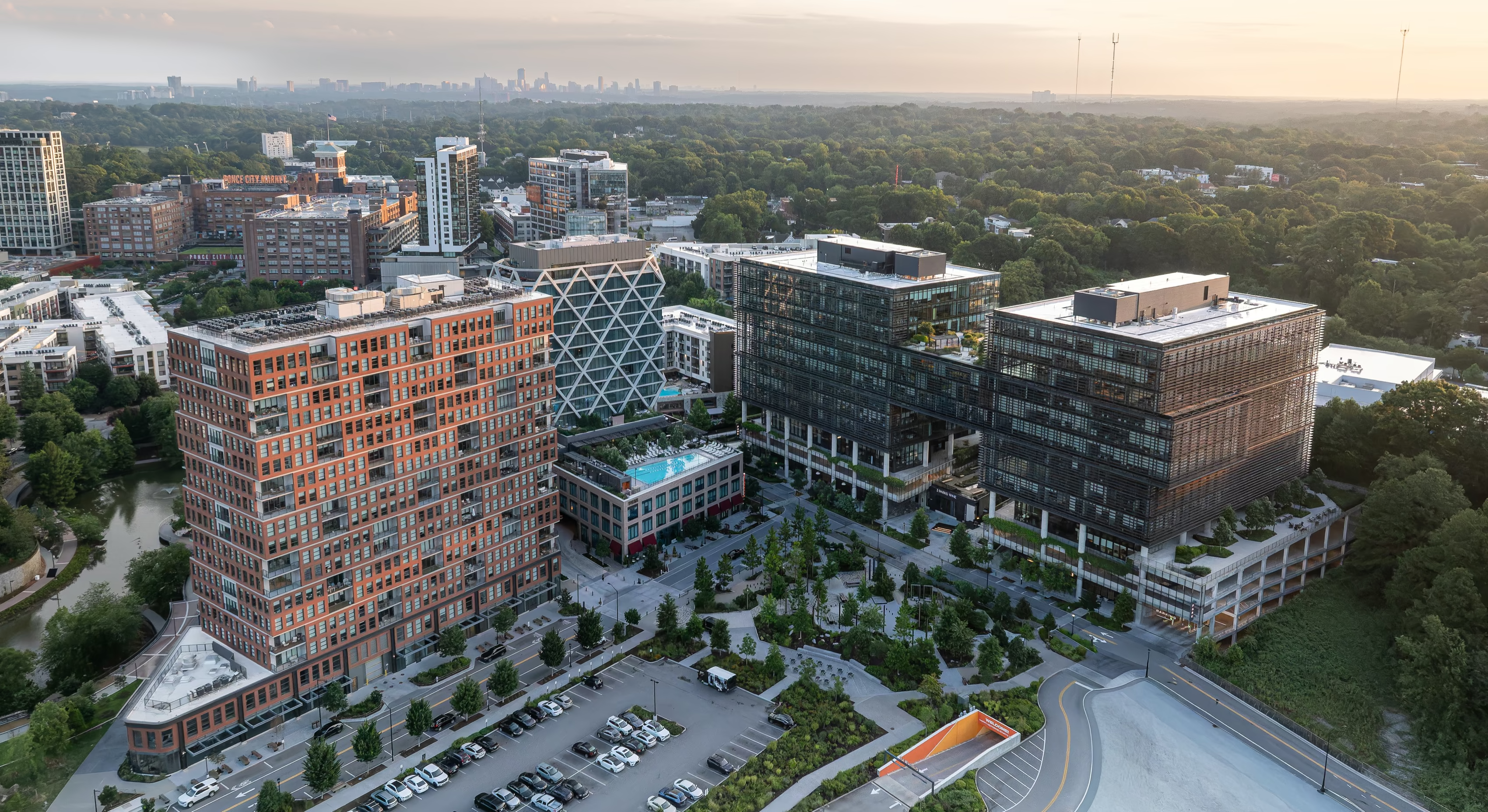
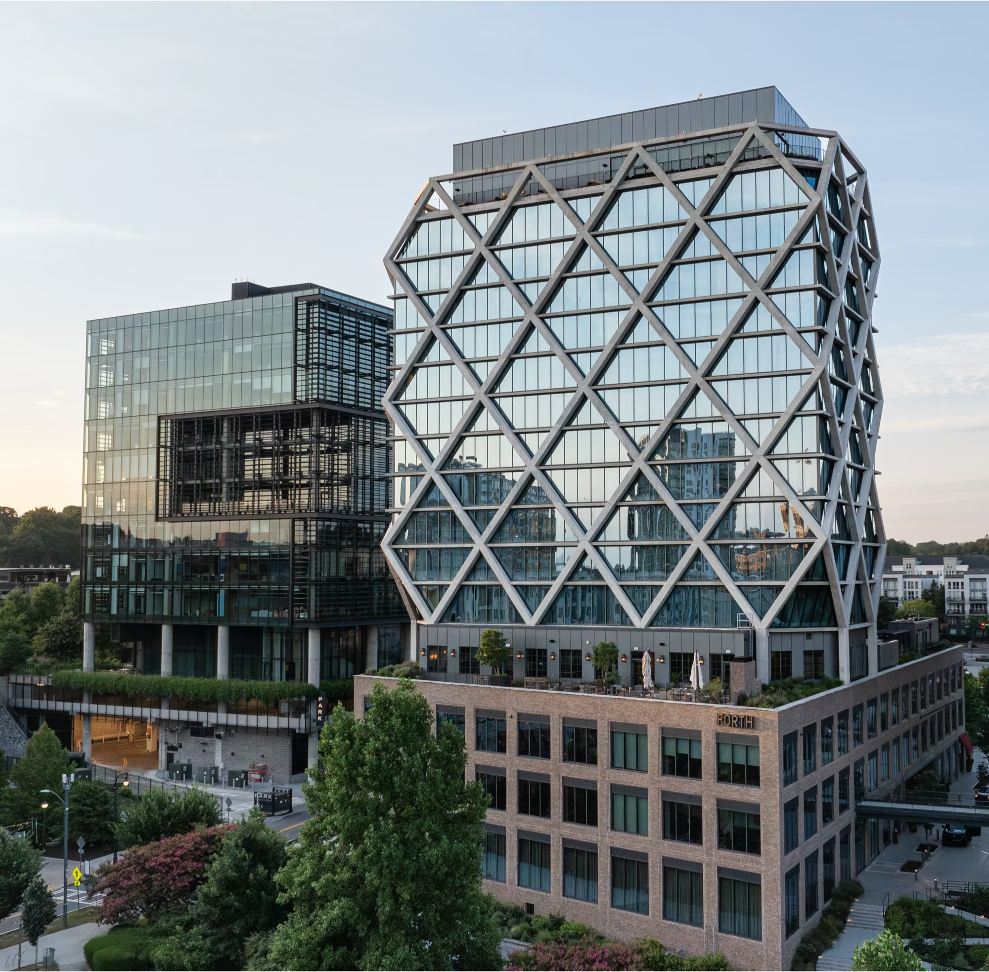
Aerial photography and film — Studio Cinq
The Leasing Site
The office pitch lives at a single address. The microsite moves from the district down to the floor plate: the film from above, the site before and after, the Olson Kundig tower, and the plan that sets it all beside the park.
Made for brokers and their clients: one continuous page. The identity carries through, the aerial film opens, the survey drawing locates, and the district’s green holds the deep sections.
futureoffice.fourthwardatl.com ↗
A District That Explains Itself
On the leasing site, the district is read through a drawing: an interactive site plan where every parcel answers. Color carries the pitch, Tower Three, now leasing, in full orange, its leased twins in clay. Hover, or tab through, and the place explains itself.